What is an Analytical Paragraph?
An analytical paragraph is a short piece of writing in which you study given information and explain it in a clear and logical way. This information is usually provided in the form of a chart, graph, table, or diagram. The main aim of an analytical paragraph is to understand the data and present the important points in simple words.
In analytical paragraph class 10, students are not expected to give their personal opinions or feelings. Instead, they should focus only on facts, comparisons, and trends shown in the data. For example, you may need to explain which category has the highest value, which one is the lowest, and how different values are related to each other.
An analytical paragraph usually includes three parts: an introduction, a body, and a conclusion. The introduction tells what the data is about. The body explains the key details and comparisons. The conclusion gives a short summary of the overall information.
This type of writing helps students improve their thinking and observation skills. It also teaches how to present information in a structured and meaningful way. With regular practice, writing an analytical paragraph becomes easier and more clear.
Analytical Paragraph Class 10 Solved Examples
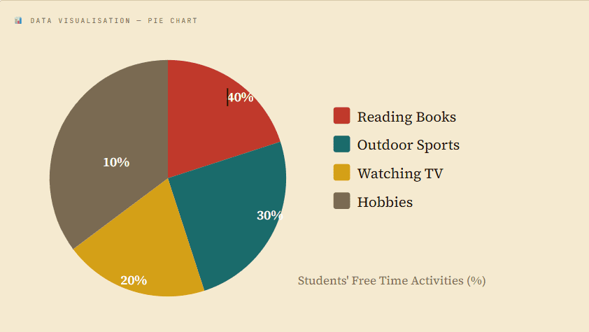
Question 1 – The pie chart shows how students utilise their free time. Write an analytical paragraph in 100–120 words describing the information given in the chart.
Answer – The pie chart presents how students utilise their free time across four activities. A significant 40% of students prefer reading books, making it the most popular leisure activity. Outdoor sports account for 30% of student time, reflecting a notable interest in physical activity. Watching television takes up 20% of their free time, while hobbies such as painting or music account for the remaining 10%. Overall, it is evident that reading remains the dominant choice, suggesting students value academic enrichment even during leisure hours. In contrast, creative hobbies receive the least attention. This data indicates a need to encourage students to explore diverse recreational pursuits beyond reading and sports.
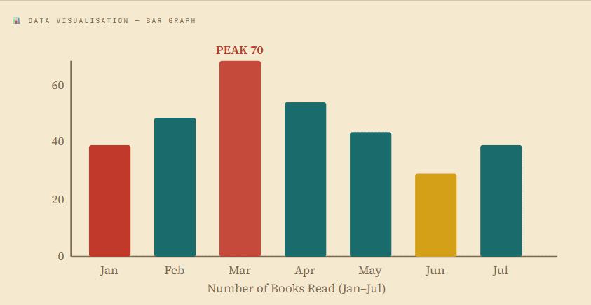
Question 2 – The bar graph depicts the number of books read by students from January to August. Write an analytical paragraph in 100–120 words describing the given data.
Answer – The bar graph depicts the number of books read by students from January to July, revealing notable monthly variations. In January, students read 40 books, and the number rose to 50 in February. The peak was observed in March at 70 books, possibly due to upcoming examination pressure motivating wider reading. April recorded 55 books, followed by a gradual decline in May and June, reaching a low of 30 books. July showed a slight recovery to 40 books. Overall, there is a clear pattern: reading activity peaks mid-year and diminishes towards summer, indicating that academic pressures significantly influence students’ reading habits. Encouraging a consistent reading culture throughout the year would greatly benefit students.
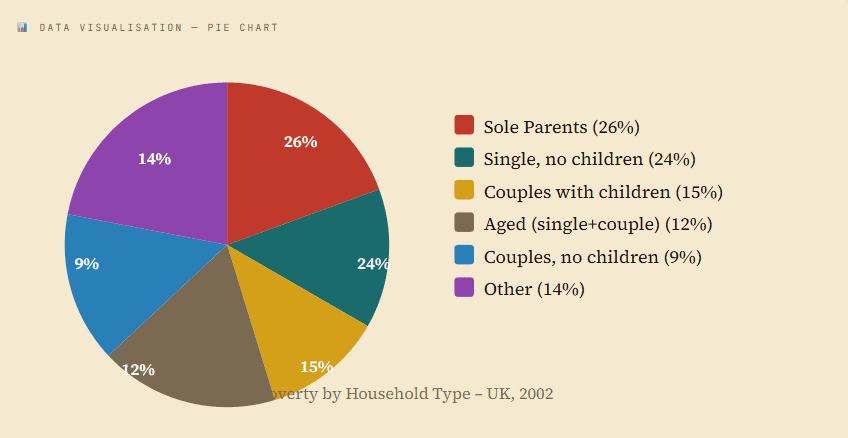
Question 3 – The pie chart shows the proportion of people from different households living in poverty in the UK in 2002. Write an analytical paragraph in 100–120 words.
Answer – The pie chart illustrates seven categories of households living in poverty in the UK in 2002. Sole parents constitute the largest share at 26%, followed closely by single people without children at 24%, together accounting for half of all poor households. Couples with children represent 15%, while aged individuals — both single and in couples — account for 12% collectively. Couples without children form the smallest group at just 9%, and the remaining 14% falls under other categories. Overall, 14% of all UK households lived under poverty that year. Notably, younger and single-parent households are disproportionately affected compared to their aged counterparts, highlighting the vulnerability of families with dependent children.
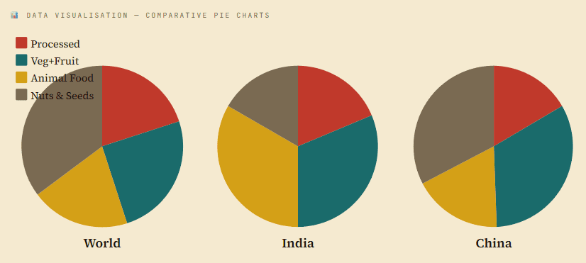
Question 4 – The pie charts show consumption habits of India, China, and the world overall in 2008. Write an analytical paragraph describing the data in 100–120 words.
Answer – The three pie charts depict food consumption patterns of India, China, and the world in 2008. Processed food dominates global consumption at 41%, and this trend is mirrored in India (39%) and China (34%), making it the leading category across all three. Vegetables and fruits constitute 29% globally, with China consuming more (32%) than India (23%). A striking contrast appears in animal food intake: Indians consume 27% compared to China’s 15%, a difference of 12 percentage points. Nuts and seeds account for nearly one-fifth of Chinese food habits, while they represent only about 11% in India. Overall, dietary patterns vary considerably between the two countries despite their shared dominance of processed food consumption.
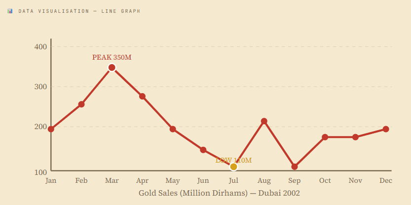
Question 5 – The graph shows estimated gold sales in Dubai in 2002. Write an analytical paragraph describing the line graph in about 150 words.
Answer – The line graph depicts estimated gold sales in Dubai across twelve months of 2002, measured in millions of Dirhams. Sales began at 200 million Dirhams in January and rose steadily through February before reaching a peak of 350 million Dirhams in March. Subsequently, sales declined sharply over the next four months, touching a low of 110 million Dirhams in July. An unexpected doubling occurred in August to 220 million Dirhams, but September witnessed an equally swift fall back to 110 million. For the remaining months, sales stabilised at around 180 million Dirhams, with a slight uptick in December to 200 million. Overall, gold sales in Dubai fluctuated considerably throughout the year, with the first quarter seeing the highest demand and mid-year recording the lowest levels, suggesting seasonal patterns in consumer purchasing behaviour.
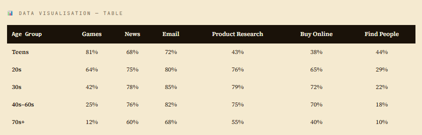
Question 6 – The table shows internet activities for different age groups. Write an analytical paragraph for the table in around 150–200 words.
Answer – The table presents internet usage across multiple age groups — from teenagers to people in their seventies for six categories of online activity. Teens lead overwhelmingly in online gaming at 81%, though their engagement with product research (43%) and online purchasing (38%) is comparatively low, reflecting their limited financial independence. In contrast, adults in their 20s to 60s are far more engaged in news consumption (75–78%), email communication (80–85%), product research (75–79%), and online purchasing (65–72%). Older adults in their 70s show reduced activity across most categories, with gaming dropping to a mere 12%. Across all age groups, searching for people online consistently attracts the least attention, ranging from 10% to 44%. Overall, the data clearly demonstrates a generational divide: younger users prioritise entertainment and social discovery, while older demographics focus on practical, information-driven activities. This pattern has significant implications for targeted digital communication and policy-making.
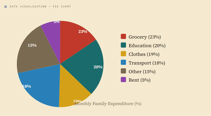
Question 7 – The pie chart represents the amount of money spent by a family on different items in a month. Write an analytical paragraph using the information given in the chart.
Answer – The pie chart provides a detailed breakdown of a family’s monthly expenditure across six categories. Grocery accounts for the largest share at 23%, indicating that food remains the top priority. Education follows at 20%, reflecting the family’s emphasis on learning. Clothes and transportation are allocated 19% and 18% respectively, forming the next tier of spending. Other miscellaneous expenses — likely stationery, cosmetics, and accessories — account for 15% of the budget. Strikingly, rent constitutes the smallest proportion at only 5%, suggesting the family may own their residence or reside in a low-cost area. Overall, the distribution indicates a balanced approach to spending, with necessities like groceries and education dominating, while rent remains a minimal burden for this household.
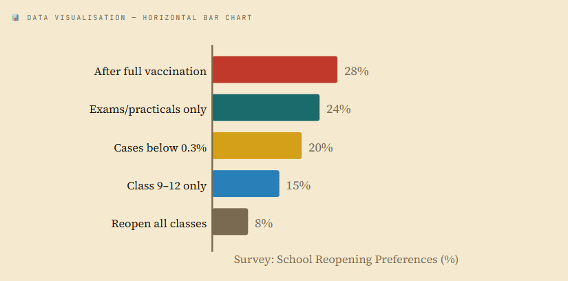
Question 8 – A survey on reopening of educational institutions in the National Capital was conducted. Write a paragraph in about 120 words analysing the listed responses.
Answer – The survey data reveals public opinion on the reopening of educational institutions in the National Capital during the COVID-19 pandemic. The largest group – 28% – believed that schools should reopen only after complete vaccination of students and staff. Nearly a quarter (24%) supported a limited reopening for examinations and practical work alone. Twenty percent advocated reopening only when case rates fell below 0.3%. A smaller segment of 15% was in favour of reopening exclusively for Classes 9 to 12, while just 8% supported reopening for all classes. Overall, the data shows that a strong majority preferred a cautious, phased approach to reopening, with vaccination status and declining case counts being the most critical determining factors for the community.
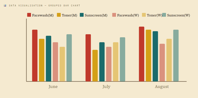
Question 9 – The bar graph shows the increasing use of skin care products by men and women over three months. Write an analytical paragraph elaborating the given information.
Answer – The bar graph illustrates the usage of three skin care products — facewash, toner, and sunscreen — by men and women from June to August. Among men, facewash is the most frequently used product, with usage rising from 33 times in June to 35 times in August, dipping slightly in July. The use of toner and sunscreen by men also increased steadily over the period, peaking in August. Among women, sunscreen emerges as the most preferred product, with usage climbing from 30 times in June to 33 times in August. Women’s toner usage showed a consistent upward trend, while facewash usage remained relatively stable. Overall, both genders increased their skin care routines over the three months, with men favouring facewash and women demonstrating a clear preference for sunscreen.
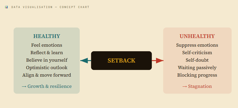
Question 10 – The concept chart displays two ways to handle setbacks — healthy and unhealthy. Write a paragraph in not more than 120 words, analysing the listed responses to the situation when one faces setbacks.
Answer – The concept chart illustrates two contrasting approaches to dealing with setbacks — healthy and unhealthy. A healthy response involves acknowledging emotions, reflecting on what can be learned, and maintaining belief in one’s abilities. Individuals who process setbacks optimistically develop resilience, align their goals, and progress forward effectively. On the contrary, an unhealthy response leads to suppression of feelings, self-criticism, and self-doubt. Such individuals often wait passively for setbacks to pass rather than actively resolving them, resulting in stagnation. Overall, the chart strongly suggests that the manner in which one processes adversity determines future outcomes. A constructive attitude that embraces setbacks as opportunities for growth is far more beneficial than an avoidant or self-destructive response pattern.
Class 10 Analytical Paragraph Practice Questions
Here are some practice questions for analytical paragraph class 10:
Question: The bar graph shows the number of students in different streams.
Answer:
The given bar graph illustrates the number of students enrolled in different academic streams. It is clear that Science has the highest number of students, followed by Commerce. Arts has the lowest number of students. The difference between Science and Commerce is moderate, while Arts has significantly fewer students. Overall, Science is the most preferred stream among students.
Question: The pie chart shows the distribution of time spent on different activities.
Answer:
The pie chart represents how students spend their time on various activities. The largest portion is dedicated to studying, which shows its importance. Leisure activities take the second position, while sports occupy a smaller share. Household work and other activities make up the remaining part. Overall, students spend most of their time on academic activities.
Question: The table shows the sales of books over five years.
Answer:
The table provides information about book sales over a period of five years. There is a gradual increase in sales from the first year to the last year. The highest sales were recorded in the fifth year, while the lowest were in the first year. This shows a positive growth trend in book sales. Overall, the data indicates increasing interest in reading.
Good Analytical Paragraph Features
To write a good analytical paragraph PDF, students should focus on the following features:
- Clarity: Sentences should be clear and easy to understand
- Logical Order: Ideas should be arranged properly
- Data Focus: Only include relevant data
- Formal Language: Avoid informal words
- Linking Words: Use words like however, overall, in contrast
It is important to note that personal opinion should not be included. The paragraph should be based only on the given data.
Step-by-Step Process to Write Analytical Paragraph
Writing an analytical paragraph class 10 becomes easy if you follow these steps:
- Step 1: Read the Question Carefully – Understand what the data represents.
- Step 2: Analyze the Data – Look for key points like highest value, lowest value, and trends.
- Step 3: Note Important Points – Write down key observations before starting.
- Step 4: Organize Ideas – Arrange points into introduction, body, and conclusion.
- Step 5: Write the Paragraph – Use simple and clear language.
Analytical Paragraph Class 10 related FAQs
1. What is an analytical paragraph in Class 10?
An analytical paragraph is a short piece of writing where students explain data from charts, graphs, or tables in a clear and simple way.
2. What is the word limit for analytical paragraph class 10?
The word limit is usually 100–120 words, so students should write short and to the point.
3. Can we give our opinion in an analytical paragraph?
No, students should not give personal opinions. They should only write based on the given data.
4. What types of questions come in analytical paragraph writing?
Questions are based on bar graphs, pie charts, line graphs, or tables.
5. How can I improve my analytical paragraph writing skills?
You can improve by practicing regularly, reading examples, and understanding how to analyze data properly.